One of the most important tools instructors have to help establish a productive remote learning experience is one that we do not always talk about: the learning management system (LMS). We often view the LMS as a digital warehouse for course content, and a repository for course grades. It can—and should—be more than this. It can be a vibrant hub of digital classroom activity.
At the end of the spring 2020 term, I surveyed students to ask what components of a course made it successful in a remote learning format. Not surprisingly, instructors were rated most pivotal. The second-highest rated feature? A well-managed learning management system.
I also asked students to think about the professor that did the best job leading a course remotely. Roughly one-third of students referenced our LMS (Canvas) in their responses. “The best instructors […] had a Canvas page that was simplistic in nature and easy to follow,” reported one student. Said another: “They had a very organized and easy to understand Canvas page.” Numerous other descriptors emerged in response to this question: “well-planned out,” “set up very well,” and “clearly outlined,” among others.
When students were asked to offer advice to faculty about effective teaching strategies in a remote setting, the LMS again featured prominently. “Have your Canvas course laid out in a way where students know exactly what is going on in class,” requested one student. Another person agreed: “It’s annoying when I’m hunting all across a Canvas page because I can’t find what I’m looking for.” This individual neatly summarizes the collective student view: “A well-managed, well-crafted, clear and understandable Canvas page can be a godsend when working remote.”
It is clear that a well-designed and well-managed online course site is vital to student success. But what does that look like? Two key concepts are central: simplicity and navigability. By simple, I mean digital course spaces that prioritize essential information and relegate or even discard non-essential content. By navigable, I mean digital course spaces that utilize a consistent structure that clearly elucidates class activities and student responsibilities.
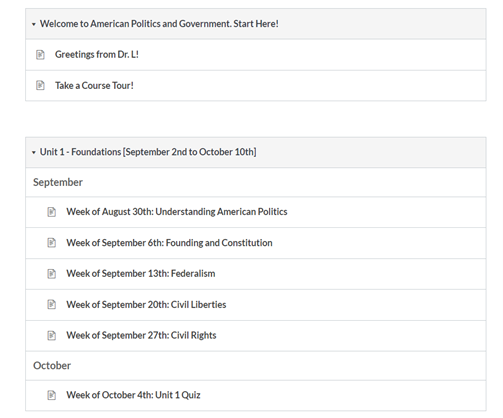
Below I offer an example of what a simple and navigable course may look like. I recommend creating a separate module for each unit in a course, arranging them in chronological order, and populating them with an individual page for each class period or each week within that unit. For example, in my introductory course in American government and politics, I create a welcome module with some preliminary information, followed by a module for our first course unit. The unit comprises five weeks of the semester, and each week has a dedicated page within the module.

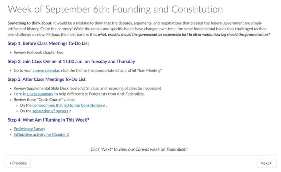
The heart of the course is organized within the weekly pages. These pages should address three key questions: What should students do before class?, What should students do after class?,and What are students responsible for delivering this week? For classes with a remote meeting element, there is a fourth question: How do I get to class?

I organize these questions into steps within the weekly page. Step 1 provides instructions for what to do before the class meets. Since this example is a remote course that students join virtually, Step 2 describes how to access the class meetings that week. [In my courses that meet face-to-face, Step 2 is simply omitted.]
Step 3 outlines additional activities to complete after our class meetings. For me, this usually includes additional video examples or extra documentation from class to review as necessary. In some cases, such as an upper division research methods course, this step will also include practice problems and answer keys. Finally, Step 4 lists any deliverables students will be submitting that week. Note that active links are embedded as much as possible in order to maximize navigation within the LMS. Reminders about dates and times are also helpful.
To be sure, different courses and instructors have different requirements and preferences, so other instructors may organize things a bit differently. However, the fundamental goals of simplicity and navigability should not vary. Build your pages with these goals in mind. Ask colleagues to review your digital course space with these objectives in mind. Better yet, consult with students before or at the beginning of the semester. We ask for feedback all the time on topics like textbook selection and teaching approach. Why not LMS course design?
Spending time creating simple and navigable LMS courses is extremely worthwhile. In recent years—and especially during the pandemic—colleges and universities have invested considerable energy, time, and money in technological tools to support various modalities of instruction. Equally important should be a commitment to using them well. Many pressing concerns in higher education in 2020—like mental health, emotional health, physical health, and skepticism about online learning quality—will remain prominent concerns for the foreseeable future.
While learning management systems cannot resolve all of the challenges we face, they can make a meaningful difference in the academic lives of our students, and perhaps alleviate some of the apprehension our students feel. For instance, a well-designed digital course space can reduce anxiety about finding and completing work. Similarly, for the many students whose familial and work obligations require them to do their classwork at unconventional hours, a simple and navigable course can facilitate learning even if the instructor is not available. One student in my class survey stressed this point by noting that when courses are delivered asynchronously, and “something was confusing, we were not able to raise our hand and clarify” the issue. This lack of clarity may be the difference between submitting an assignment (on time) or not.
The dual goals of simplicity and navigability in digital course design are not valuable because of the Covid-19 crisis—the pandemic simply cast their value into clearer relief. I have used variations of the model above for years, although the pandemic certainly prompted me to focus even more acutely on my design goals.
Despite the distressing jolt delivered to higher education in 2020, our collective experience actually underscores a comforting axiom: good teaching practices are good teaching practices. True, some modifications will be necessary under certain circumstances and across disciplines; however, a simple, navigable approach to LMS course design will be valuable long after the Covid-19 pandemic (hopefully) subsides, and students will appreciate it regardless of course modality.
Eric Loepp is an assistant professor of political science at the University of Wisconsin-Whitewater.
"want" - Google News
February 01, 2021 at 12:54PM
https://ift.tt/2L6zIh7
What Students Want: A Simple, Navigable LMS Course Design - Faculty Focus
"want" - Google News
https://ift.tt/31yeVa2
https://ift.tt/2YsHiXz
Bagikan Berita Ini


0 Response to "What Students Want: A Simple, Navigable LMS Course Design - Faculty Focus"
Post a Comment